
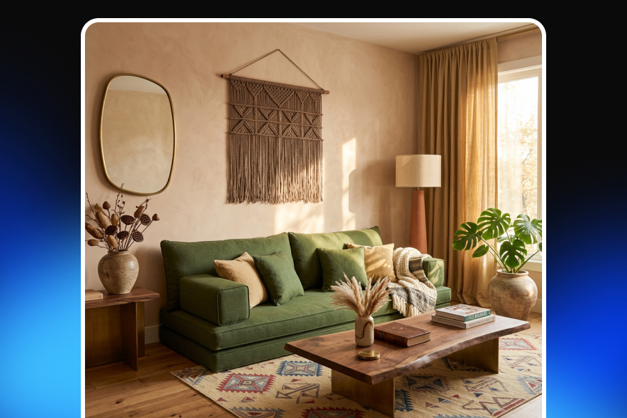
A beautiful sofa placed in a perfectly styled living room can still look wrong. The lighting may be technically attractive. The colors may match. The composition may even look like something from an interior design magazine. Yet there is a subtle feeling that tells you the image was generated rather than photographed. For home decor brands, that distinction matters.
Customers shopping online cannot sit on a chair, feel the texture of a rug, examine the grain of a wooden table, or see how a lamp interacts with the rest of a room. Product imagery has to do much of that work instead. A simple studio photo can show the product clearly, but a strong lifestyle scene does something different: it helps the customer imagine the product inside a real home.
That is why home decor product photography increasingly goes beyond clean white-background images. Brands need believable rooms, natural lighting, realistic proportions, convincing textures, and product placement that feels intentional without looking staged.
AI product photography has made creating these scenes significantly easier. But generating a room is not the difficult part anymore. The challenge is creating one that looks as though a photographer actually stood inside it with a camera. The difference comes down to photographic realism.
Why Lifestyle Product Photography Matters So Much for Home Decor
Lifestyle product photography works especially well in home and living because context is part of the purchasing decision.
Consider a dining chair shown against a plain background. You can see its shape, color, and materials. Now place the same chair around a dining table in a softly lit apartment, with enough surrounding furniture to understand its proportions. The second image answers questions the first one cannot.
How large does the chair feel next to a standard dining table? Does the color work in a warm interior? Does the design feel minimalist, traditional, Scandinavian, or contemporary? Does the product look comfortable in an actual living space?
This is what strong home decor lifestyle photography provides: context without distracting from the product.
The goal is not simply to create a beautiful interior. The goal is to create a believable environment in which the product still feels like the reason the image exists.
That balance is important. If the room becomes more visually interesting than the item being sold, the image may work as interior inspiration but fail as e-commerce photography.
Why AI Product Photos Often Look Like Renders
One of the most common misconceptions about realistic AI imagery is that adding words such as “photorealistic,” “8K,” or “professional photography” will automatically make an image look real.
It rarely works that way.
Humans are surprisingly good at noticing physical inconsistencies, even when they cannot immediately explain what feels wrong.
A scene may look polished but still feel artificial because the chair casts a shadow in one direction while the window suggests light should come from another. A table may technically fit inside the room but appear slightly oversized. A velvet sofa may have texture, yet the material behaves more like smooth plastic. Decorative objects may be arranged with unnatural precision.
These small inconsistencies accumulate.
The result is an image that looks more like an architectural visualization or 3D render than realistic product photography.
Creating photorealistic product images therefore requires more than visual quality. Lighting, scale, materials, perspective, shadows, reflections, and product geometry must agree with one another.
When they do, the viewer stops thinking about how the image was created. They simply see a photograph.
Start With Light That Could Actually Exist
Lighting is one of the fastest ways to expose an artificial scene.
Real interior photography usually has a dominant light source. It might be sunlight entering from a large window, softer daylight from an overcast sky, warm practical lamps, or a combination of natural and artificial illumination. Whatever the source is, everything else in the scene should respond to it.
Imagine a living room with a large window on the left. The side of a coffee table facing that window should generally receive more light. Objects should cast shadows in a direction consistent with the window position. Reflective surfaces should respond to the same environment.
When every object appears independently illuminated, the room begins to feel assembled rather than photographed.
For believable AI lifestyle product photography, descriptions such as “soft natural window light from the left” are often more useful than simply asking for “beautiful lighting.” Specificity creates physical logic.
The same applies to color temperature. Warm evening sunlight combined with extremely cool shadows and neutral artificial lamps can create a subtle mismatch. Real photographs certainly contain mixed lighting, but those mixtures behave predictably.
A convincing image does not need perfect lighting. It needs coherent lighting.
Shadows Should Connect the Product to the Room
A surprisingly small shadow can determine whether an object looks like it belongs in a scene.
Furniture and decor items should normally produce contact shadows where they meet other surfaces. The legs of a chair should feel planted on the floor. A vase should make physical contact with the table beneath it. A rug should sit naturally within the room rather than appearing pasted onto the floor.
Missing or overly soft contact shadows create the visual impression that objects are floating.
The opposite problem can happen too. Extremely dark, sharp shadows in a softly illuminated room are equally suspicious.
When creating realistic lifestyle product images, look beyond whether a shadow exists. Ask whether its direction, softness, intensity, and position make sense given the light source.
These are the kinds of details viewers rarely analyze consciously, but they strongly influence whether an image feels photographic.
Perspective Needs to Behave Like a Camera
Real photographs are created through a lens.
That sounds obvious, but it is one of the most important principles when building believable AI-generated interiors.
Furniture should follow the perspective of the room. Horizontal and vertical lines should behave consistently. Objects farther from the camera should scale naturally. The height from which the scene appears to have been photographed should also make sense.
For example, an image showing a sofa from approximately seated eye level will feel very different from one photographed from a high architectural angle.
Neither is necessarily wrong. Problems appear when different parts of the same scene seem to have been viewed from different camera positions.
A realistic camera angle also helps establish the intended mood.
A moderately wide lens can show enough of the environment to give buyers context. Go too wide, however, and sofas, tables, or room dimensions may begin to look stretched. An overly dramatic wide-angle effect might make a small room appear enormous, which can also misrepresent product scale.
The best furniture lifestyle photography usually gives viewers enough space to understand the setting without making them question the proportions.
Scale Is Critical in Home Decor Product Photography
A bottle of skincare can be shown against an abstract background without much spatial context. A sofa cannot.
Home decor products exist in relation to rooms, walls, floors, people, and other furniture. That makes realistic scale one of the defining characteristics of good home decor product photography.
If a lamp is slightly too large relative to a side table, the image may immediately feel artificial. If a dining table appears too small for its chairs, the room loses credibility. If a rug does not correspond naturally with the surrounding furniture arrangement, customers may struggle to understand its true dimensions.
This is why room context should not be treated as decoration alone. It acts as a visual scale reference.
When creating AI product photography for home decor, surrounding objects should therefore be selected carefully. Chairs, doors, coffee tables, windows, books, plants, and other familiar objects give viewers subconscious reference points for size.
The product should feel physically possible inside the space.
Materials Need More Than “Realistic Texture”
Home decor is highly material-driven.
Wood, linen, marble, ceramic, velvet, brushed metal, glass, leather, boucle, rattan, and polished stone each interact with light differently.
A generic “realistic texture” instruction is rarely enough.
Wood should have believable grain rather than repetitive patterns. Fabric should show subtle weave, folds, compression, or softness where appropriate. Metal should reflect surrounding light without turning into a mirror unless the finish is actually highly polished. Glass should have transparency, reflections, edge highlights, and thickness that correspond to the object.
Small imperfections often help.
Real materials are not mathematically perfect. Natural wood has variation. Fabric responds to gravity. Handmade ceramics may have tiny surface differences. Even highly polished commercial photography contains microscopic irregularities that prevent objects from feeling computer-generated.
The purpose is not to make products look damaged. It is to avoid a level of synthetic perfection that rarely exists in a real photograph.
Protect Product Fidelity
Photorealism means very little if the product itself is wrong.
For an e-commerce brand, a beautiful AI-generated room is not useful if the sofa suddenly has different stitching, the lamp base changes shape, the table gains an extra leg, or the fabric color shifts significantly.
This is where product fidelity becomes essential.
The generated lifestyle environment should adapt around the product—not redesign it.
Important details such as geometry, proportions, branding, materials, patterns, hardware, colors, and distinctive design features should remain consistent with the original item.
This is particularly important for furniture because relatively small geometric changes can alter the product's identity.
A customer who sees one version of a chair in a lifestyle image and receives another version in reality may not interpret the difference as an AI limitation. They may simply feel that the listing was misleading.
Realism therefore has two layers: the room needs to look real, and the product needs to remain true.
Create a Lived-In Room, Not a Perfect Showroom
One reason some AI interiors look obviously artificial is that everything appears too deliberately arranged.
Every book is perfectly aligned. Every cushion points in the same direction. Every decorative object sits at an ideal angle. Nothing appears to have been touched.
Real lifestyle photography usually contains controlled imperfection.
A throw blanket might fall naturally over one side of a sofa. Books may be stacked slightly unevenly. A plant may lean toward the light. Cushions may have subtle creases. A dining table may contain a few carefully chosen objects without looking like every square centimeter has been styled.
This is the difference between visual chaos and a lived-in space.
The strongest home decor lifestyle scenes often look effortless even though they are carefully composed. They feel styled, but not staged.
Keep the Product as the Visual Anchor
An AI room generator can create elaborate interiors very quickly, which introduces a new problem: overdesign.
If the product is a ceramic lamp, the scene does not need a dramatic fireplace, sculptural staircase, panoramic ocean view, six statement furniture pieces, and twenty decorative objects.
Every additional element competes for attention.
A commercial lifestyle image should create enough environmental storytelling to make the product desirable while maintaining a clear visual hierarchy.
Composition matters here.
The product does not always need to sit directly in the center, but viewers should understand immediately what they are supposed to notice. Framing, light, surrounding negative space, depth of field, and nearby objects can all guide attention.
Think of the room as supporting evidence. It should explain how the product lives, not become the product itself.
Use Depth of Field Carefully
Depth of field is strongly associated with photography, which makes it tempting to blur backgrounds aggressively in an attempt to create realism.
Used poorly, however, artificial blur creates exactly the opposite effect.
In interior photography, the amount of background separation depends on focal length, subject distance, aperture, and camera position. A large sofa photographed in a wide room will not normally have the same extremely shallow depth of field as a close-up portrait.
Lifestyle scenes often benefit from moderate depth.
The product remains clearly defined while the environment stays readable enough to provide context.
For smaller home accessories—candles, vases, tableware, or decorative objects—a shallower depth of field may feel more natural because the camera can realistically be positioned closer to the subject.
The effect should match the type of photograph being simulated.
Do Not Ignore Reflections
Reflections are another area where generated imagery frequently breaks physical logic.
Consider a polished coffee table positioned beside a window. The reflective surface should respond somehow to the light and objects around it.
The reflection does not need to be perfectly visible, but it should make sense.
The same is true for mirrors, glass cabinets, glossy ceramics, metal lamps, and polished stone.
Common problems include reflections that show objects that do not exist, reflections pointing in impossible directions, duplicated furniture, or surfaces that are reflective in one part of the object but completely matte elsewhere.
If an image contains several glossy materials, inspecting reflections becomes especially important before using it in a product listing or campaign.
Color Accuracy Is Part of Realism
A lifestyle image can be visually beautiful and still perform poorly if the product color is inaccurate.
Warm ambient lighting naturally changes how colors appear, but there should be a limit.
A cream sofa should not become yellow. Walnut should not suddenly resemble dark espresso wood. A muted sage fabric should not turn gray simply because the scene uses cooler lighting.
This is particularly relevant for online shopping because customers often use product photography to judge finish and color before purchasing.
Lifestyle imagery can establish mood, but supporting product images should still make the actual product appearance clear.
For this reason, brands should evaluate generated scenes not only for aesthetic quality but also for color accuracy, material accuracy, and product consistency.
How to Create Lifestyle Product Photography Without a Photoshoot
Traditional home decor photography can require significant logistics.
A brand may need a studio or location, furniture transportation, photographers, stylists, lighting equipment, props, set construction, editing, and multiple shooting days.
That model still makes sense in many situations, particularly for major campaigns or when highly specific physical interaction needs to be captured.
But it is no longer the only option.
AI product photography can allow brands to take an existing product image and explore multiple lifestyle environments without physically rebuilding the scene each time.
A table can appear in a warm Mediterranean dining room, a modern city apartment, or a minimalist Scandinavian interior. A lamp can be shown in a bedroom, home office, or reading corner. The product can remain the same while the visual context changes according to campaign, audience, platform, or season.
Platforms such as Adject are especially useful in this workflow because the starting point is the product rather than a completely unrelated generated interior. That distinction matters for e-commerce: the objective is not simply to create attractive AI art, but to build usable product visuals around an item a brand actually sells.
The best results still require judgment.
AI reduces production friction, but the brand must decide which scenes are believable, which ones accurately represent the product, and which ones support the intended customer experience.
A Better Workflow for Realistic AI Lifestyle Images
Instead of trying to generate the final scene in one attempt, treat AI lifestyle creation more like a real photography production.
Start with the product itself. Make sure the source image clearly communicates its shape, materials, proportions, and important details.
Then define the environment.
Do not begin with vague instructions such as “luxury living room.” Describe a space that could realistically exist: room style, surface materials, dominant light source, time of day, camera position, and the role the product should play.
Next, evaluate the first scene based on physical consistency rather than whether it is immediately impressive.
Ask yourself:
Does the product still match the original?
Does its scale make sense?
Where is the light coming from?
Do the contact shadows support that light?
Are materials behaving realistically?
Does the perspective feel consistent?
Are reflections plausible?
Is the product still the visual focus?
Does the room feel designed for humans rather than generated for an algorithm?
Then refine.
Often the most realistic result is not the most dramatic option. It is the image where nothing calls attention to the fact that the scene was generated.
Photographed vs. Rendered: The Small Details Decide
A rendered-looking image usually does not fail because of one catastrophic mistake.
It fails through accumulation.
The room is slightly too perfect. The shadows are slightly too soft. The rug is slightly too clean. The table reflection is slightly incorrect. The sofa is slightly too large. The lighting seems to come from everywhere. Every decorative item looks professionally positioned.
Individually, these details may be easy to overlook.
Together, they create the unmistakable feeling of CGI.
Photographic realism works in the opposite way. It emerges when hundreds of small visual signals agree with one another.
The light has a source. The shadows belong to the light. The materials respond correctly. The camera has a believable position. The objects have weight. The product maintains its real geometry. The environment contains enough imperfection to feel inhabited.
No single “photorealistic” prompt can replace that logic.
What Home Decor Brands Should Prioritize
The goal of AI product photography for home decor should not be to prove that AI can generate an impressive interior.
Customers do not care how technically impressive the image generation process was.
They care whether the product looks appealing, accurate, trustworthy, and easy to imagine inside their own home.
That means realism should serve commerce rather than novelty.
A strong lifestyle scene should help customers understand the product's proportions, materials, aesthetic, and possible use. It should create aspiration without becoming misleading. It should look polished without losing the tiny visual irregularities that make photography believable.
Most importantly, the product should remain recognizable from image to image.
AI can dramatically expand the number of environments a home decor brand can create. But more images are only valuable when they maintain visual credibility.
Final Thoughts
The gap between an AI-generated room and a convincing photograph is getting smaller, but realistic imagery still requires more than generating an attractive scene.
For home decor, the most important ingredients are physical consistency and product fidelity.
Natural lighting must correspond with realistic shadows. Furniture needs believable proportions. Camera perspective should behave like a real lens. Wood, fabric, glass, stone, and metal should respond naturally to light. Reflections should make sense. The room should feel lived in rather than mathematically perfect.
When those details work together, lifestyle product photography without a traditional photoshoot can feel surprisingly natural.
That is the real standard to aim for.
Not an image that makes someone say, “This is impressive for AI.”
An image they simply assume was photographed.


