
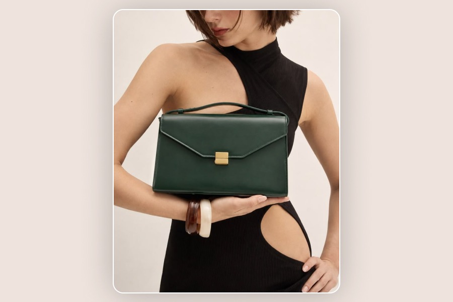
AI product photography has become dramatically better in a short period of time. A single product photo can now be turned into studio shots, lifestyle scenes, campaign visuals, and social media creatives without organizing a traditional photoshoot. And yet, there is a problem almost anyone who has experimented with AI product images eventually notices.
Something looks... off.
The bottle seems to float above the table. The leather bag looks more like polished plastic. A glass container reflects a light source that does not exist. The product is technically sharp, but somehow feels pasted into the background. Worse, the image may look realistic at first glance while quietly changing the packaging, logo, proportions, or color of the actual product. That is why learning how to make AI product photos look real is not simply about adding words like “photorealistic,” “8K,” or “ultra-detailed” to a prompt. Realism comes from something much more fundamental: the image needs to behave like a photograph.
Light needs to come from somewhere. Objects need weight. Materials need texture. Reflections need a reason to exist. Perspective needs to match the camera. And most importantly, the product still needs to look like the product you are actually selling. That last part is especially important in ecommerce. A beautiful image is not useful if the AI quietly redesigns your product.
Why Do AI Product Photos Look Fake?
People are surprisingly good at noticing visual inconsistencies, even when they cannot explain exactly what is wrong. You may not consciously think, “the shadow direction is inconsistent with the key light,” but you still notice that the image does not feel believable. Most fake-looking AI product photos fail for one or more of the same reasons:
lighting does not follow the geometry of the scene,
the product has weak or missing contact shadows,
materials are too smooth,
reflections do not match the surroundings,
product scale or perspective is slightly wrong,
depth of field behaves unnaturally,
small details drift,
the AI changes the actual product,
or the entire scene looks unrealistically perfect.
The important point is that realism is cumulative. One small mistake may go unnoticed. Five small mistakes make the image immediately feel artificial.
What Actually Makes a Product Photo Look Real?
Realistic product photography is built on visual logic. In a real photograph, every element affects another element. If light comes from a window on the left, the brightest surfaces should generally face that window. Shadows should fall in a physically believable direction. A glossy bottle should reflect parts of the room around it. A product sitting on a table should interact with that surface. Background blur should correspond to the apparent lens and distance. AI-generated product images often become unrealistic when these relationships stop making sense.
There is also another layer that is particularly important for brands: product fidelity. Realism and product fidelity are not the same thing. An AI-generated product image can look completely photographic while still showing the wrong product.
For ecommerce, that is a serious problem.
Product fidelity means preserving characteristics such as the product's shape, color, proportions, materials, textures, components, packaging, labels, and branding consistently across generated images. Your SEO research correctly identifies this distinction as one of the major opportunities for making the article more useful than generic AI-photography advice. So a successful AI product photo needs to pass two tests:
Does this look like a real photograph?
And:
Does this still look like the real product?
You need both.
1. The Lighting Doesn't Follow Real-World Physics
Lighting is one of the fastest ways to make an AI image feel fake. In professional product photography, light has direction, intensity, softness, color, and distance. These qualities influence everything from highlights to shadows and reflections. AI images sometimes produce locally convincing lighting that becomes inconsistent when you look at the whole scene. For example, imagine a skincare bottle photographed next to a window.
The left side of the bottle is brightly illuminated, suggesting that the window is the main light source. But the shadow falls toward the same window. Meanwhile, the background objects seem to be lit from the opposite direction. Each element may look reasonable individually.
Together, they break the illusion.
When evaluating AI product photography lighting, ask a simple question:
Where is the light actually coming from?
You should be able to answer that by looking at the image. Realistic lighting does not necessarily mean dramatic lighting. In many ecommerce scenes, soft directional light is more believable because it produces gradual transitions between highlight and shadow. Instead of prompting only for “beautiful studio lighting,” describe the physical situation more clearly. For example:
“Soft natural daylight entering from a large window on the left, subtle fill light from the front, gentle shadows falling to the right.”
That gives the model a lighting system rather than an aesthetic adjective.
2. The Product Has No Real Contact Shadow
One of the most common reasons an AI product looks like it is floating is surprisingly simple:
There is no convincing shadow where the object meets the surface. This is called a contact shadow. When a real bottle, shoe, box, chair, or cosmetic container sits on a surface, light cannot fully reach the exact area underneath it. That creates a small, darker shadow close to the point of contact. Without it, the brain receives conflicting information. The background says “this product is sitting on the table.” The lighting says “this object may actually be hovering a few centimeters above it.” Contact shadows do not need to be dramatic. In fact, excessively dark shadows can look equally artificial.
What matters is that the product appears physically connected to the scene. When reviewing realistic AI product photos, zoom in around the bottom edge of the product. If there is a strange glowing gap, an overly soft halo, or no shadow at all, the image will often feel composited rather than photographed.
3. Materials Look Too Smooth, Plastic, or Perfect
Another major AI tell is surface texture.
Real materials are complicated.
Leather has grain. Wood has irregular fibers. Fabric has weave. Brushed metal contains tiny directional marks. Glass has subtle reflections, refractions, imperfections, and changes in transparency. AI frequently simplifies these details. As a result, different materials begin to look strangely similar.
Leather becomes smooth plastic.
Ceramic looks digitally polished.
Fabric becomes a flat colored surface.
Wood grain looks painted on rather than part of the material. This is one reason people describe some AI-generated product images as “plastic-looking.” If you want realistic product textures, describe the material itself rather than simply asking for “more detail.” For a leather bag, for example, “natural leather grain with subtle creasing around stitched areas” gives more useful information than “ultra-realistic handbag.” For furniture, “visible natural wood grain with subtle tonal variation” is more meaningful than “8K wooden table.” The same applies to micro-texture.
A real commercial photograph contains small variations that may seem insignificant individually but collectively make the image convincing.
Those imperfections are not visual noise.
They are part of realism.
4. Reflections Don't Match the Environment
Reflective products are especially difficult for generative AI. Consider:
glass perfume bottles,
polished metal,
glossy cosmetics packaging,
watches,
jewelry,
chrome appliances,
sunglasses,
transparent plastic.
These objects do not simply have “a reflection.” They reflect the environment around them. A glass bottle positioned beside a bright window should contain highlights related to that window. A polished metal product in a dark studio should reflect large dark areas and the studio lights around it. One common AI mistake is generating attractive highlights that have no relationship to the scene. You may see three bright vertical reflections on a bottle even though there is only one visible light source. Or the product may reflect something that does not appear anywhere in the environment.
These inconsistencies often make AI ecommerce images feel CGI-like. When working with reflective products, describe both the material and the light. Instead of:
“Realistic glass bottle.”
Try:
“Clear glass bottle with subtle window reflections on the left edge, controlled specular highlights, transparent glass edges, and realistic refraction.”
Realistic reflections need environmental logic.
5. Perspective and Scale Feel Wrong
Sometimes there is nothing obviously broken in an AI product photo, yet the product still feels pasted into the scene.
Perspective is often the reason.
Every photograph has a camera position.
The height of the camera, viewing angle, lens characteristics, and distance from the subject determine how objects appear in relation to one another. If the background suggests that the camera is slightly above the table but the product looks like it was photographed directly at eye level, the two visual systems conflict.
Scale can cause a similar problem.
Imagine a coffee mug placed next to a laptop. If the mug is subtly too large, you may not immediately calculate the dimensions—but you will still feel that something is strange. Product scale becomes even more important in lifestyle product photography because familiar objects provide visual reference points. Hands, furniture, phones, books, shelves, countertops, and people all tell the viewer how large the product should be. This is why perspective consistency and realistic scale should be treated as part of the generation process, not as minor editing details.
Depth of field matters too
AI often uses background blur as a shortcut for “professional photography.” But realistic depth of field is not simply “blurry background.” If part of the product is 10 centimeters behind another part, the change in sharpness should make sense relative to the rest of the scene. Excessive blur can make a small ecommerce product look like a miniature. Inconsistent blur can make the image feel digitally assembled. Use shallow depth of field when it serves the composition—not simply because it looks cinematic.
6. AI Changes the Product Itself
This is where AI product photography becomes more than a realism problem. It becomes an accuracy problem. Generative models are designed to create plausible visual content. They are not automatically designed to reproduce every detail of a commercial product perfectly. That can lead to subtle changes such as:
a bottle becoming taller,
a cap changing shape,
a handbag gaining extra stitching,
furniture legs changing thickness,
packaging colors shifting,
patterns being simplified,
jewelry stones moving,
or a product gaining components that do not exist.
These mistakes are particularly dangerous because the final image may still look excellent. A shopper does not care that the generated image is technically impressive if the product delivered to their home looks different from what they saw online. That is why AI product fidelity should be evaluated separately from visual quality. When reviewing an AI product image, compare it directly against the source product photo. Do not ask only:
“Does this look good?”
Ask:
“Is the product still correct?”
7. Logos, Labels, and Fine Details Drift
Logos and product labels remain another weak point in many AI image generation workflows. Text is highly sensitive to even small generative changes. The AI may:
misspell a brand name,
alter kerning,
change the label hierarchy,
move text,
invent extra letters,
simplify packaging,
or slightly redesign the logo.
These errors may be obvious on a large cosmetics bottle but much harder to notice on a small ecommerce thumbnail.
Fine details can drift in the same way.
Buttons move.
Seams disappear.
Patterns change.
Hardware becomes asymmetrical.
This is why maintaining product consistency in AI images usually requires more than writing a better text prompt. For branded products, keeping a real product reference in the workflow is significantly safer than asking a model to recreate the product from memory or text description alone. Your research specifically highlights reference-image workflows as a major way to improve shape, color, material, logo, and packaging consistency.
8. Everything Looks Too Perfect
AI images are often criticized for obvious mistakes.
But perfection can be just as suspicious.
Perfectly symmetrical highlights.
Perfectly smooth surfaces.
Perfectly clean tables.
Perfectly arranged background objects.
Perfectly flawless skin.
Perfectly uniform shadows.
Real commercial photography is controlled, but it is not mathematically perfect. Even an expensive studio shoot contains tiny irregularities. A fabric folds differently on each side. Highlights vary slightly across a curved surface.
Wood grain is inconsistent.
A lifestyle background contains natural visual variation. When every element feels equally polished, equally sharp, and equally intentional, the image can start looking synthetic.
Natural imperfections help.
The goal is not to make the photo messy. The goal is to avoid removing every signal that suggests the scene exists in the physical world.
How to Make AI Product Photos Look Real
Once you understand why AI product photos look fake, improving them becomes much easier. Instead of repeatedly regenerating an image and hoping the next version looks better, work through the scene logically.
Start With a Real Product Photo, Not Just a Prompt
If you are generating images for a real ecommerce product, one of the most important decisions happens before you write the prompt.
Use a strong product reference image.
A clear source photo gives the AI much more information about:
shape,
proportions,
color,
materials,
packaging,
branding,
and surface details.
If your source image is blurry, heavily compressed, poorly lit, partially hidden, or photographed at an extreme angle, the model has less reliable product information to preserve. Think of the reference image as product data. The cleaner that data is, the better your chances of maintaining product identity. Ideally, start with an image where:
the whole product is visible,
important details are not hidden,
colors are reasonably accurate,
the product edges are clear,
and the image has enough resolution to show fine details.
AI can create the environment. It should not have to guess what the product looks like.
Describe Physical Conditions, Not Just Aesthetic Goals
Compare these two instructions:
“Create an ultra-realistic luxury product photo, cinematic, 8K, masterpiece.”
Versus:
“Premium skincare bottle on a warm stone counter, soft natural window light from the left, subtle contact shadow beneath the bottle, realistic glass reflections, 50mm product photography perspective, shallow but natural depth of field, neutral interior background.”
The second version is more useful because it describes how the photograph works. It tells the AI about:
material,
surface,
lighting,
shadow,
camera behavior,
and environment.
This matches the prompt structure highlighted in your SEO research:
Product + Material + Surface + Lighting + Camera Angle + Lens/Depth + Environment + Constraints.
A Simple Prompt Formula for More Realistic Product Photos
You do not need an enormous prompt.
You need the right information.
A useful structure is:
Product
What is the product?
Material
Glass, leather, brushed metal, cotton, ceramic, wood?
Surface
What is it sitting on or interacting with?
Lighting
Where does the light come from? How soft is it?
Camera
What angle and photography style make sense?
Depth
Should the background be sharp, softly blurred, or distant?
Environment
Studio, bathroom, kitchen, street, bedroom, café?
Constraints
What should not change?
For example:
“Use the uploaded perfume bottle as the exact product reference. Preserve the bottle shape, cap, label placement, proportions, and original color. Place it on a light travertine surface in a minimal bathroom setting. Soft morning window light from the right, realistic contact shadow, subtle glass reflections and refraction, eye-level product photography, natural 50mm perspective, gentle background depth of field. Do not alter the packaging, logo, text placement, bottle proportions, or product color.”
Notice what is missing.
There is no need to repeat:
“ultra realistic, hyper realistic, photorealistic, 8K, masterpiece, award-winning.”
The prompt is doing more useful work without them.
Fix the Scene One Problem at a Time
If a generated product image looks fake, avoid changing ten variables at once.
Diagnose the problem.
Does the product float?
Fix the contact shadow.
Does the glass look plastic?
Fix material texture, transparency, and reflections. Does the product look pasted into the background? Check perspective, lighting direction, scale, and color temperature.
Did the bottle change shape?
Improve product fidelity instead of trying to fix the lighting. A diagnostic workflow is much more repeatable than endless regeneration.
Compare Against the Original Product Before Publishing
This step should be mandatory for ecommerce. Place the generated image and original product photo next to each other. Check:
shape, proportions, color, logo, text, packaging, materials, accessories, pattern, seams, hardware, buttons, stitching, and any small feature customers might rely on. The image can be beautiful and still be commercially inaccurate. That distinction matters because ecommerce visuals are not simply decorative content. They influence what customers expect to receive.
Think Like a Photographer, Not Just a Prompt Writer
The most reliable way to improve AI product photo realism is to learn a few basic photography principles. You do not need to become a professional photographer. But understanding these concepts helps enormously:
where the main light comes from,
how soft versus hard light behaves,
how shadows interact with surfaces,
how perspective changes with camera position,
how focal length affects appearance,
how depth of field works,
and how different materials respond to light.
Once you understand those principles, you begin noticing problems before the image is published.
More importantly, you can describe the fix.
Instead of saying:
“This image feels fake.”
You can say:
“The product has no contact shadow, the reflection suggests a second light source, and the camera perspective does not match the table.”
That is a much more useful workflow.
The Final Realism Checklist Before You Publish
Before using an AI-generated product image on an ecommerce store, ad, marketplace listing, or campaign, inspect it once more. Ask:
Product accuracy: Is this still the exact product?
Shape: Did the AI change its proportions?
Color: Does the product color match the real item?
Logo and text: Are branding and labels correct?
Lighting: Can you tell where the light comes from?
Shadows: Do they follow that light direction?
Contact: Does the product actually appear to touch the surface?
Materials: Does glass look like glass, leather like leather, metal like metal?
Reflections: Do reflective surfaces respond to the environment?
Perspective: Does the product camera angle match the background?
Scale: Is the product realistically sized relative to nearby objects?
Depth of field: Does the blur behave like a real lens?
Imperfections: Does the image contain enough natural variation to avoid the overly perfect AI look?
Hands and people: If a person appears, do anatomy, grip, skin texture, and product interaction make sense?
Trust: Would a customer receive the product they believe this image represents?
If an image passes all of those checks, it is far more likely to feel photographed rather than generated.
Realistic AI Product Photography Is About Consistency
There is no single prompt that magically makes every AI product image realistic. The best results come from consistency.
Lighting should be consistent with shadows.
Shadows should be consistent with surfaces.
Reflections should be consistent with the environment. Perspective should be consistent with the camera. Materials should be consistent with the real product. And the generated product should remain consistent with the product you actually sell. That is the difference between an AI image that simply looks impressive and an AI product photo that can actually function as commercial visual content.
AI product photography works best when the technology is used to create what traditional photography normally provides around the product—new settings, compositions, campaign concepts, backgrounds, and visual variations—without unnecessarily reinventing the product itself. The goal should not be to hide the fact that AI was involved. The goal should be to remove the visual inconsistencies that make the image unbelievable. Because ultimately, realistic AI product photos follow the same rules as real photography: believable light, believable materials, believable space, and an accurate product.
